Roku’s latest update transforms how users navigate its streaming ecosystem, moving beyond the traditional grid to a more fluid, personalized interface.
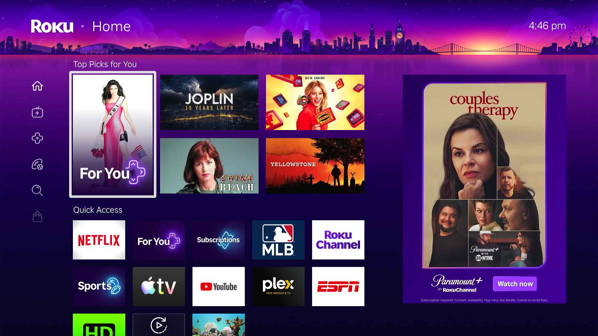
The new home screen is designed to reduce clutter and improve content discovery without sacrificing ease of use. It introduces dynamic sections that adapt based on user behavior, while still offering quick access to essential functions like search and recommendations.
Why This Matters for Creators
For creators and content providers, the redesign presents both challenges and opportunities. The shift toward a more algorithm-driven layout means that visibility isn’t just about placement—it’s about how well content aligns with user preferences. Roku’s approach balances personalization with discoverability, which could reshape how channels and shows gain traction.
Key Changes in the New Home Screen
- Dynamic, adaptive sections that reorder based on usage patterns.
- Simplified access to search, recommendations, and account settings.
- Streamlined navigation for quick jumps between content types (movies, TV shows, live TV).
The update also introduces subtle but meaningful tweaks to how users interact with the interface. For example, long-pressing a channel icon now opens a menu of related content or settings, reducing the need to dig through multiple layers. This kind of efficiency is a nod to modern streaming habits, where speed and intuitiveness are non-negotiable.
Industry Implications
Roku’s move reflects broader trends in streaming UX design, where platforms are increasingly prioritizing user behavior over static layouts. The change could set a benchmark for how other players approach home screen organization, particularly as competition for attention grows more intense. For viewers, the result is a cleaner, faster experience—but for creators, it means adapting content to fit these new navigation patterns.
What to Watch
The redesign will roll out gradually over the coming weeks, with no changes to Roku’s core functionality or pricing structure. Users who prefer the old layout can toggle back to a more traditional grid view temporarily, though the new design is intended to become the default over time.