In an era where technical precision is table stakes for modern shooters, Marathon has positioned itself with a solid foundation. Its servers handle loadouts without stutter, and matchmaking remains snappy even during peak hours. But beneath that performance lies a design question that could redefine the game’s trajectory: Can its interface evolve in step with its competitive ambitions?
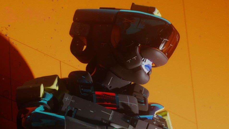
Marathon’s UI is a study in deliberate but disjointed choices. Fonts shift unpredictably across menus, sizes vary without clear hierarchy, and color contrasts—some neon, some muted—create visual noise rather than clarity. Navigation is layered with submenus: Shell Select for class choice, loadout for gear, vault for storage, armory for weapons. The structure feels intentional but often defies instinct, forcing players to pause mid-action to orient themselves.
- Multiple font styles and sizes on a single screen
- Neon color scheme causing visual strain in fast-paced scenarios
- Excessive submenus slowing character setup and loadout
The game’s core mechanics, however, remain unshaken. Servers are stable, matchmaking is efficient, and the PvP edge that Marathon promises is undeniable when players finally navigate past the interface. But if this complexity lingers, it risks turning a seamless competitive experience into one where players spend more time reading menus than reacting to opponents.
A cleaner, more scannable design could shift this dynamic without sacrificing the game’s identity. The challenge for Marathon is balancing innovation with usability—ensuring that the interface enhances rather than distracts from the edge that makes PvP engaging. Whether it succeeds will determine whether its technical strengths translate into lasting competitive dominance or remain a footnote in an otherwise promising launch.